
Reference
Moliri on phone and tablet
On a phone or tablet Moliri is the same interface as on a computer, with the same projects, permissions and data. There is no separate phone version. What changes depends on the width of the screen.
| Width | Device | Interface |
|---|---|---|
| Up to 700 pixels | Phone | Bar at the bottom, menu, basket and filter as a sheet over the full height, list and object at full width |
| Up to 1024 pixels | Tablet in portrait, such as an iPad | As on a computer, with the main menu at the top; a project’s sidebar is at least wide enough for the filter |
| Wider | Computer, iPad in landscape | As on a computer |
The phone is meant for work in the depot and on the move: find an object, look at it, pin it, add photos, change fields, browse and filter a whole project, files, libraries, the address book and the profile. Administration and tools such as the data model, the layout editor and the wall planner can be used on a phone, but are built for computers and tablets (see Administration and tools ).
The bar at the bottom
On a phone every page has a bar with four buttons at the bottom, within reach of the thumb.
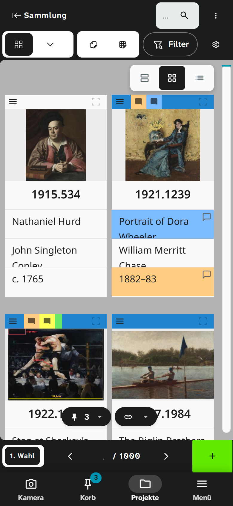
| Button | In a project | Outside a project |
|---|---|---|
| Camera | The project’s live camera | The live camera across all projects you may read |
| Basket | The work basket , with the number of pinned objects on the button | The same |
| Projects | The project overview | The same |
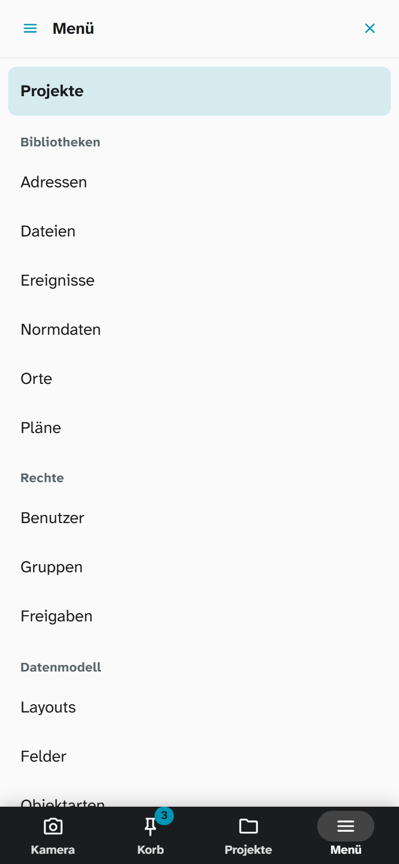
| Menu | The main menu with all pages, the profile, the language and logging out | The same |
The bar has no search of its own. A number you type into the field above the hits in the live camera, across all projects outside a project. In a project Filter at the top opens the full-text search and the other filters (see A project on a phone ).
While the keyboard is open, because an input field has the focus, the bar steps aside and frees the space. The same happens while the live camera fills the screen.
Sheets
Menu, basket and a project’s filter open as a sheet: over the full height of the screen, with the bar still visible below. Tapping another button of the bar switches to that sheet; tapping the same button again or ✕ closes it.
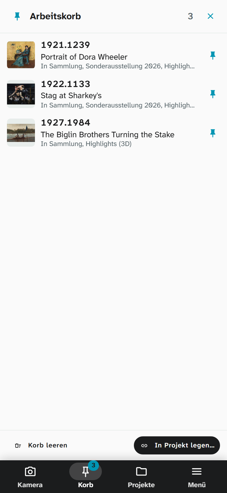
On a computer and on a tablet the work basket stands as a sidebar at the right edge, and the page beside it stays usable.
A project on a phone
The top holds two rows: the project’s name with the quick search and ⋮, below it the view, Object and Batch, Filter and the view settings. Behind ⋮ are editing history, checks and data import and export; they slide in from the left over the list.
Filter
Filter opens a sheet with everything that narrows the list: at the top the saved filters with the button to reset them, below them full-text search, sorting and detail search as in the sidebar on a computer. The button at the bottom says how many objects the list shows and closes the sheet.
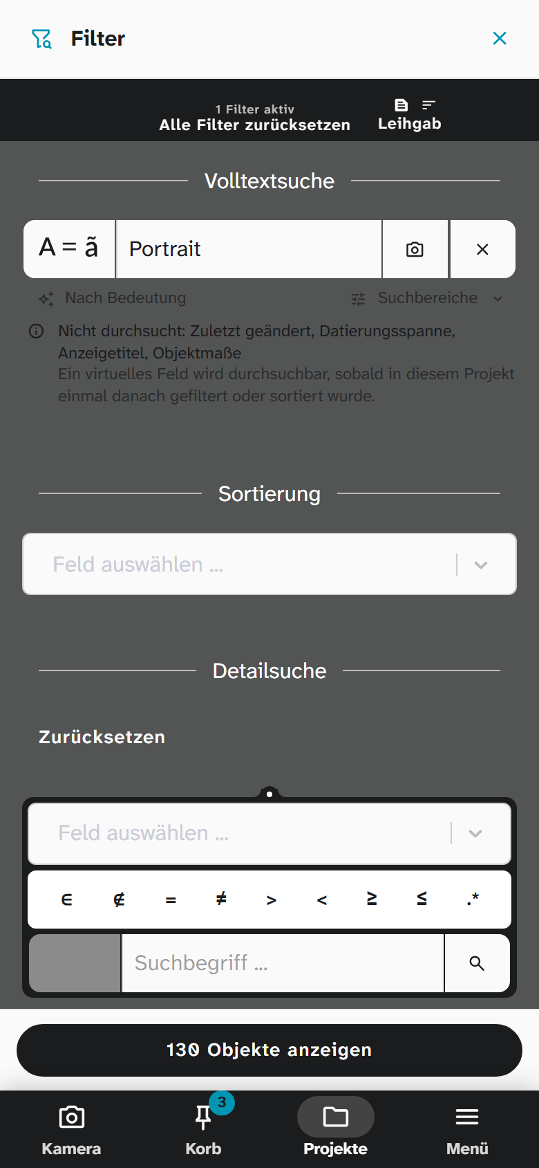
When something narrows the list, the button carries the number of filters, such as Filter · 2, and turns light. As on a computer it counts the full-text search, each condition of the detail search, the sorting, Pinned only and hidden objects.
Gallery and list
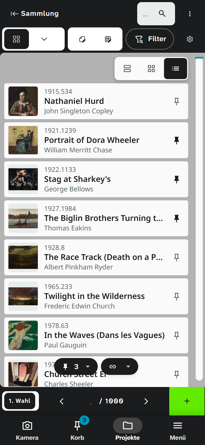
Above the gallery you choose between one column, two columns and the list. The choice holds on this device only; the tile size on a computer stays as it is. Until you choose, the gallery follows the tile size of the view, with two columns at most.
The list shows one row per object: the first image and the first three text fields of the view, usually number, title and one more field. Tapping the row opens the object, the pin on the right puts it into the work basket.
Table
You push the table sideways with your finger. On the left the icons of each row and the first column of the view stay in place, so you always see which object a value belongs to.
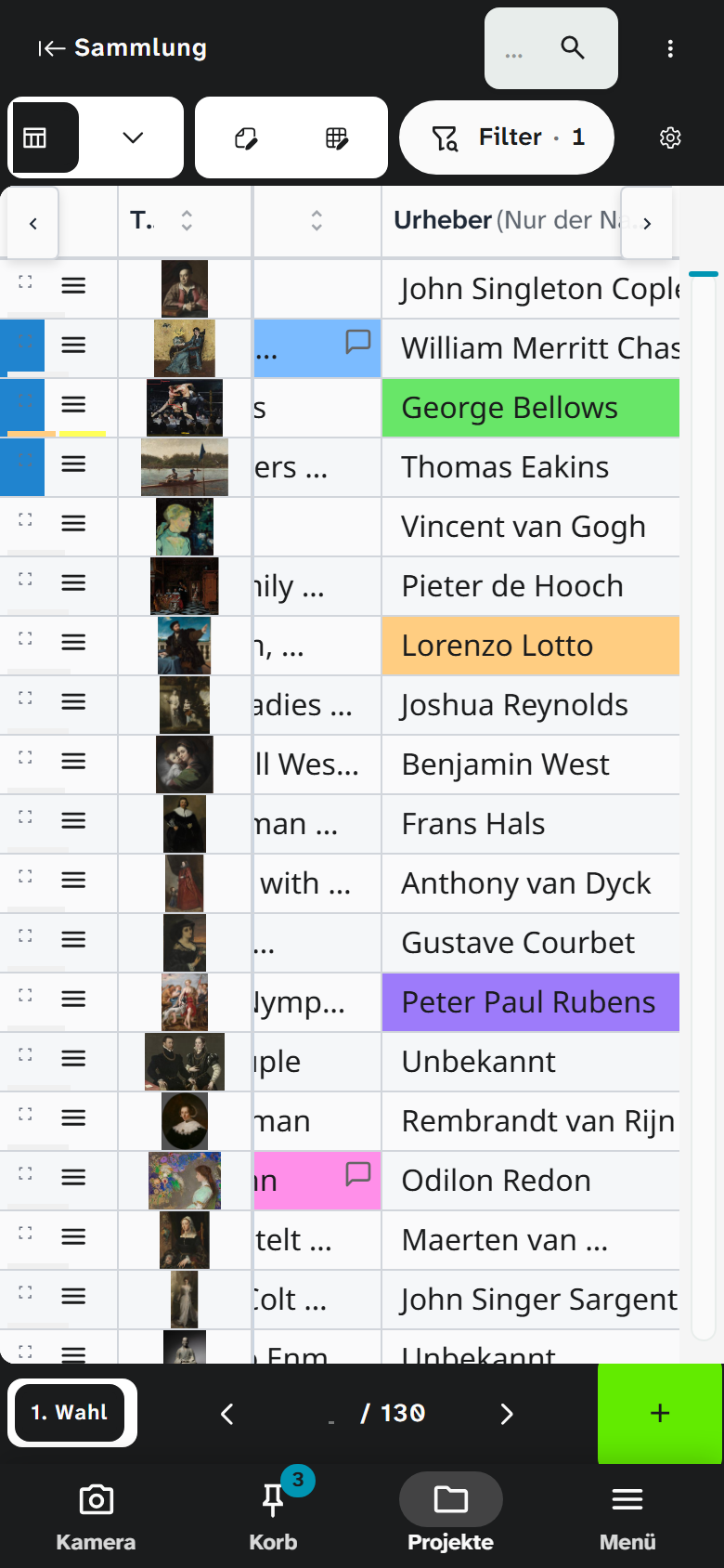
Below gallery and table the buttons for pinned and hidden objects stay within reach above the bar.
Calendar and kanban show as on a computer; you swipe the kanban’s columns sideways.
An object
An open object fills the screen. At the top the arrow leads back to the list, beside it the layouts stand as a strip you swipe sideways, and the tools icon. At the bottom you page to the previous and next object.
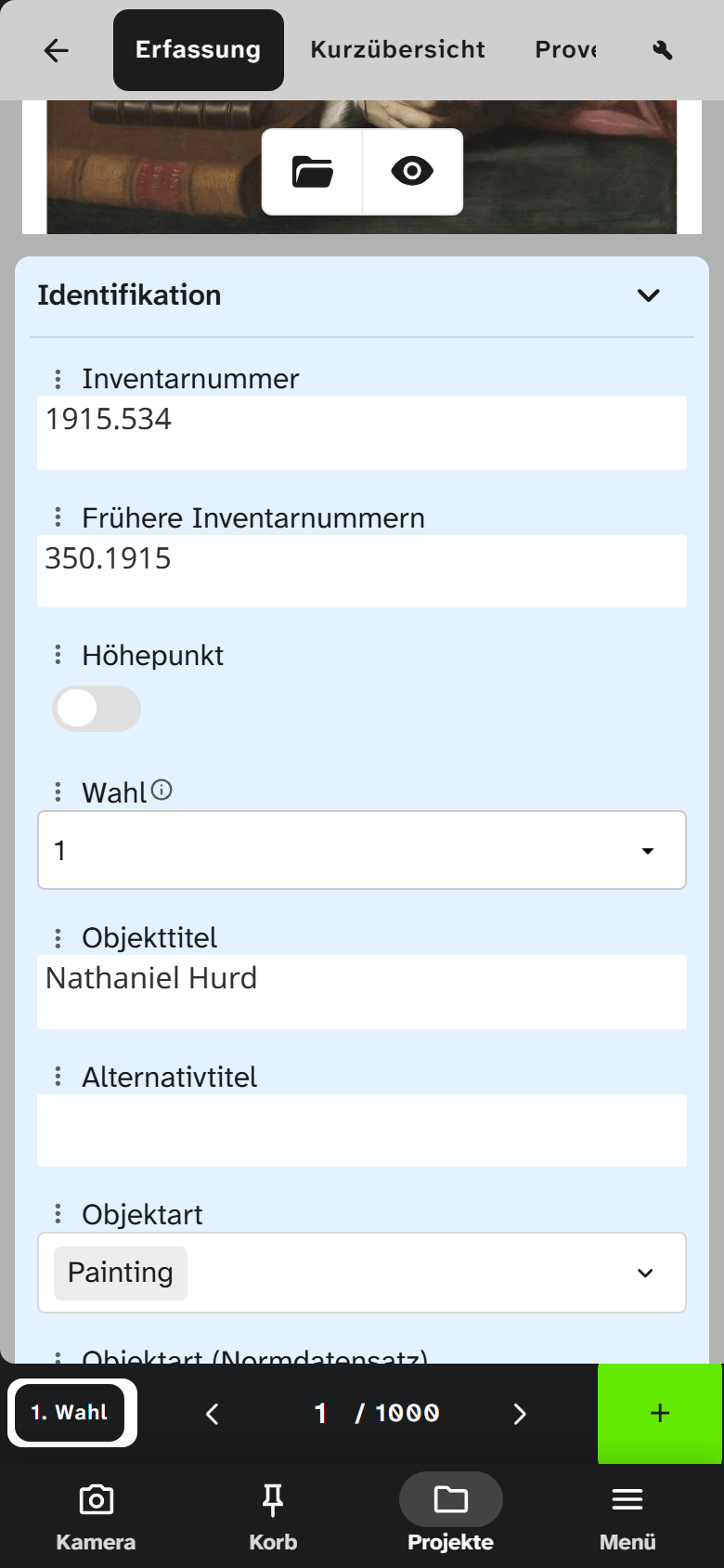
The form stands in one column. The layout’s fields follow one under the other in the order in which you read the layout on a computer, each across the full width. A field is at least as high as in the layout and grows with its content, for example a long description or many chosen values. The coloured boxes and wide headings a layout uses to group fields become sections. A tap on the heading folds a section and opens it again; a folded section stays folded on the next object.
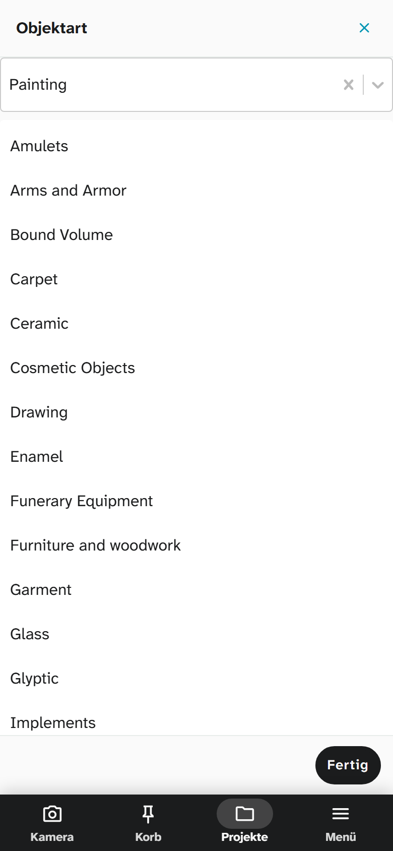
A select field opens a sheet when you tap it: the search field at the top, the list of values below. With a single choice the sheet closes as soon as you have picked a value. With a multiple choice you pick several values one after the other and close the sheet with Done.
The project decides which layout an object opens with on a phone. Under Projects, edit project, tab Layouts, the Phone button beside a switched-on layout makes it the project’s phone layout (see Create a project ). It then leads the strip, the others follow. Without a phone layout the phone opens the first layout, as a computer does. On a computer and a tablet the mark does not apply; there the form keeps the arrangement of the layout.
The field menu
Every field has a field menu with colour, comment, source, the uncertain marker, copying the value and the field details with the history (see Add annotations ). On a phone or tablet you open it in two ways:
- Tap ⋮ before the field label.
- Press and hold the field label until the menu appears.
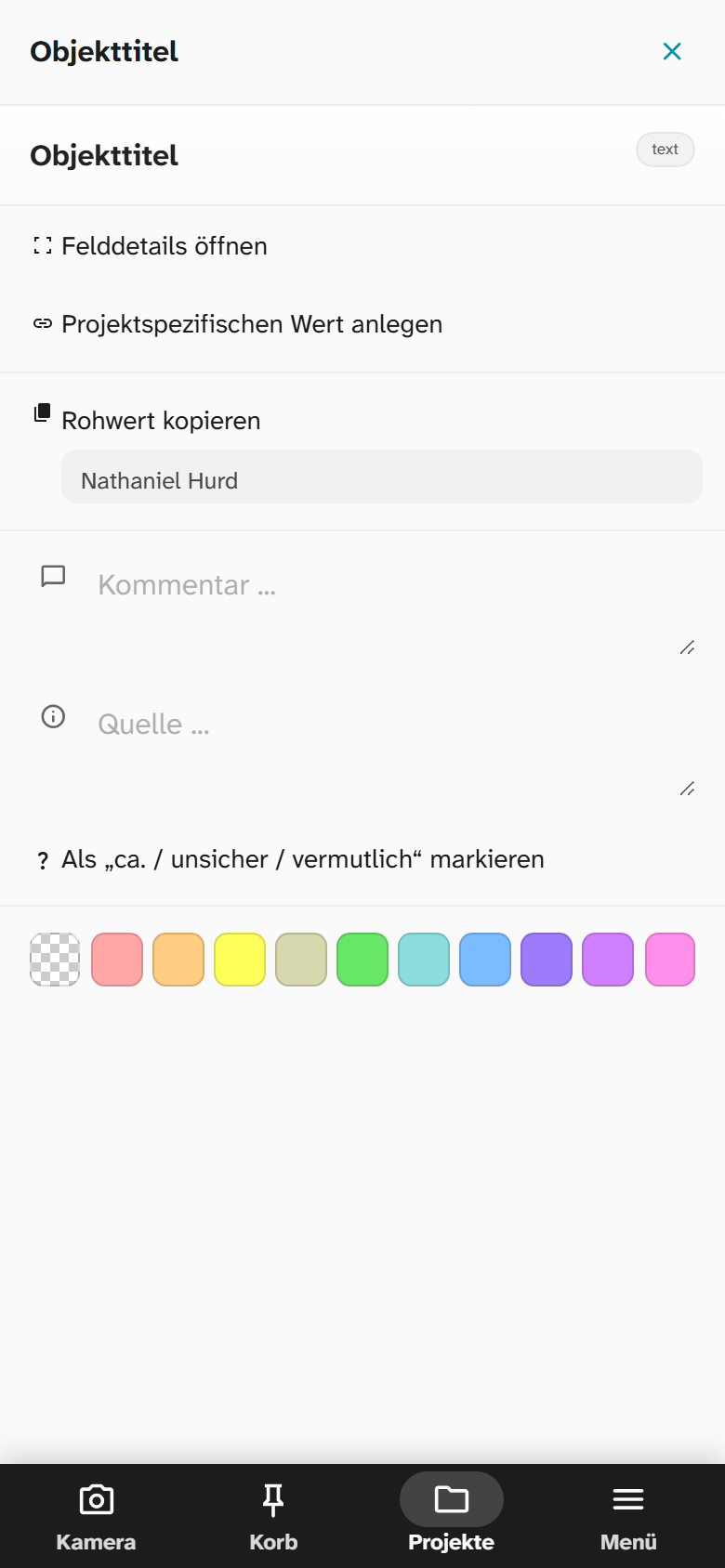
On a phone the menu opens as a sheet, on a tablet as a menu beside the field. A colour or another entry closes it; on a phone also ✕ or the back button, on a tablet a tap beside it. On a computer ⋮ appears only while the mouse is over the field, and a right click on the field opens the same menu.
The other pages
In the project overview the status groups stand as a strip above the list, and the timeline is folded away; the flag at the bottom edge brings it back. Edit project shows its fields one below the other.
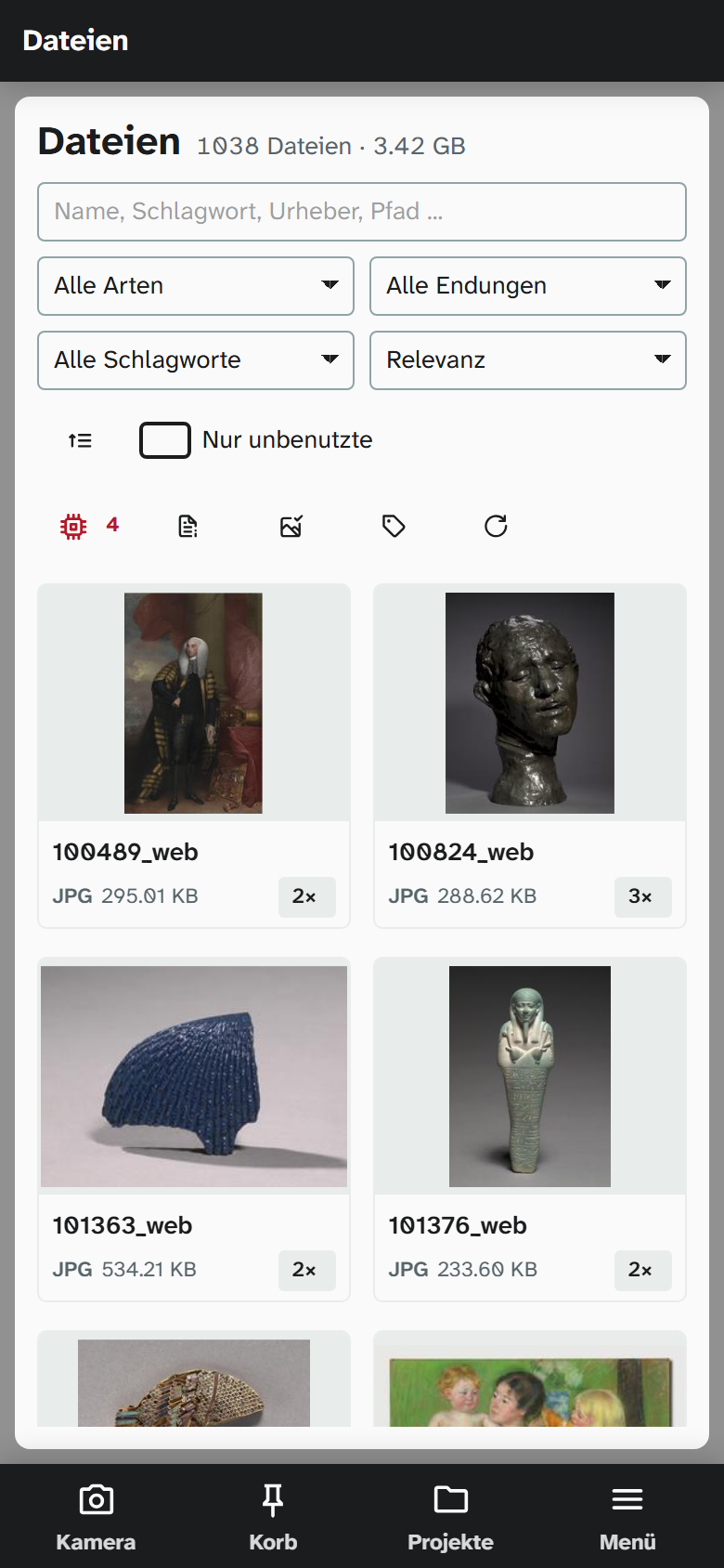
On the pages outside the projects, such as files, authority data, addresses, locations, events, plans and the profile, the jump list is one strip above the list: the groups of a list, the countries and places of the address book, the sections of the profile and the settings. You swipe it sideways and tap an entry. While you scroll, it stays at the top below the page’s name. A page’s main button, such as New field, stands to the right of its title. The search field below takes the full width, the selects stand two side by side. Files show two tiles per row with name, format, size and the number of uses.
Administration and tools
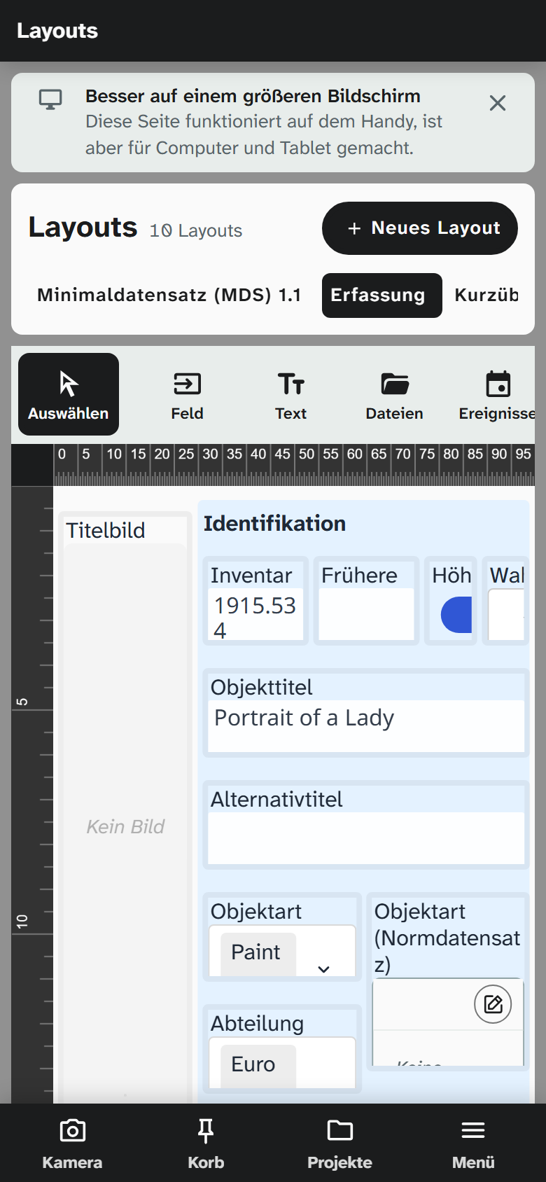
These pages can be used on a phone: nothing lies on top of anything else, everything can be reached, and the page scrolls. They are built for computers and tablets, and a quiet note at the top says Better on a larger screen. ✕ hides it for that page; this holds on this device, another phone shows it again. All settings share one note.
| Page | On a phone |
|---|---|
| Object types, link types, fields, field types, virtual fields, metadata standards, import functions | List with the jump list as a strip |
| Users, groups, settings | The same |
| Layout editor | Tools as a row to swipe, below it the canvas, below that the properties of the chosen element |
| Edit plan (wall planner) | The same; the properties take at most a third of the height |
| Event rules, number ranges | The chain of rules above the chosen rule |
Two places say in the note what stays on the larger screen: in the file window the phone shows the image to look at and zoom into, while cropping, marks and areas are edited on a computer or tablet. For Word reports you create the report on the phone as well; templates are built and edited on a computer or tablet.
Back
Android’s back button and Safari’s swipe back first close what lies over the page: a sheet, a dialog, the live camera or a project’s sidebar. Only when nothing is open any more does back lead to the previous page.
| Situation | Back |
|---|---|
| A sheet or dialog is open | Closes it; the page below stays as it was |
| A dialog over a sheet | Closes the dialog first, the sheet the next time |
| The dialog holds unsaved input | Asks first whether to discard it. With Cancel the dialog stays open |
| An object was opened from the basket or the camera | Leads back, and the sheet or the camera is open again |
On a computer the same holds for dialogs: the browser’s back button closes an open dialog instead of leaving the page.
Adding it to the home screen
Moliri can be added to the home screen from the browser. It then opens with its own icon like an app, without an address bar, and starts with the project overview.
| Device | How |
|---|---|
| Android with Chrome | Menu ⋮ › Install app or Add to home screen |
| iPhone and iPad with Safari | Share › Add to Home Screen |
On iPhone and iPad only Moliri on the home screen gets notifications, such as the one for confirming a login (see Notifications to the phone ). Moliri on the home screen has its own sign-in there, separate from Safari.
Installed this way Moliri still needs a connection to the instance: without a network it shows and saves nothing. In return it loads the current state at every start, so an update of the instance reaches the phone without anything to do.
Read more
- Interface : the layout on a computer
- Live camera and work basket
- Operation : browsers and devices